What Is A Subscribe Page? + Newsletter Landing Page Examples
If you want people to sign up for your email newsletter, just slapping a few basic opt-in forms around your website isn’t gonna cut it.
Because you haven’t actually made anyone care about your newsletter. And let’s be real: why would they, when your opt-in forms say something like “subscribe for updates!” with no real details on what it’s about?
Which is why need a Subscribe page.
Instead of just throwing up some forms and hoping for the best, a Subscribe page gives you a dedicated space to make a case for why people should care about and subscribe to get your emails.
Here’s what yours should include, plus some real-life examples you can take inspiration from.
What is a Subscribe Page?
A Subscribe page is a page on your website that exists solely to get people to sign up to your newsletter. It makes it super easy to share your newsletter link when it makes sense.
If you have a landing page for a freebie/lead magnet, it’s similar. But a Subscribe page focuses on promoting your newsletter specifically and getting people to sign up just for that. I like to think of it almost like a mini sales page that sells someone on joining your email list.
By positioning your newsletter as the valuable thing it actually is – rather than just begging people to “sign up for updates!” – you’ll see more conversions. AND you can rely less on your free lead magnets to do all the heavy lifting of growing your list.
Key Elements: What a Subscribe Landing Page Should Include
There are no rules – it *is* your website, after all, and every newsletter is different. But if you’re starting from a blank page with zero clue about what to include, these are the nice-to-haves:
- Interesting headline: NOT something like “Subscribe for weekly updates!” I beg of you. Remember that people visiting your site may have never heard of you before or know what you do (translation: they don’t give a f*ck about you yet). So your headline needs to hook them!
- Engaging description: Explain what kind of content they’ll get if they subscribe and who it’s for. Keep it relatively simple (because people coming to this page may be brand new to your world and lingo), but also, you don’t have to be boring!
- Email frequency: A lot of people really appreciate knowing how often they’ll get emails. Let them know right away how often you send newsletters. That may be weekly, biweekly, or monthly — either way, being upfront about the frequency can help prevent unsubscribes because people know exactly what to expect.
- Examples of past newsletters: Some people are hesitant about filling their inbox with yet another thing. Letting them sample a few past editions can assure them your content isn’t just noise or fluff. You can use preview links from your email provider, or, even better: link to an actual newsletter archive.
- Social proof: People are more likely to want to subscribe if they know other people are subscribed to your newsletter and enjoy it. You could do something as simple as dropping a “Join [hundreds] of others…” in your newsletter description. Or, if you’ve received nice replies to your emails, share screenshots of those.
- Mini bio: Assume that anyone who lands on your Subscribe page came from an external source – like social media or Google – and doesn’t know anything about you or your business. Use a mini bio/about section to give them the quick Spark Notes version of who you are and why they should care about what you have to say.
Best Examples of Newsletter Landing Pages (Creative Entrepreneur Edition)
I’m not going to leave you hanging without showing you some real examples of subscribe landing pages done right.
(Fun fact: I’m actually subscribed to all of these newsletters, and would 100% recommend them – so go subscribe, too.)
Hello & Co Creative
Amy at Hello & Co Creative writes a copywriting newsletter for business owners called The Rough Draft. Her Subscribe page is instantly eye-catching – if you know anything about Amy, you’d know she used to be a website designer in addition to being a website copywriter, so, makes sense.
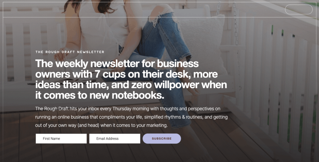
WHY IT WORKS:
- The description – I mean, duh, Amy *is* a copywriter after all.
- She includes real screenshots of replies to her newsletters, which is great social proof and somehow just feels more authentic than typed text.
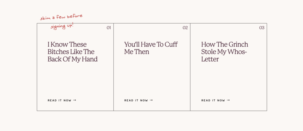
- She links to three past editions from The Rough Draft archives, which are all click-worthy and indicative of the overall vibe of her newsletter.
You can view The Rough Draft landing page and subscribe here.
Guapa Studios
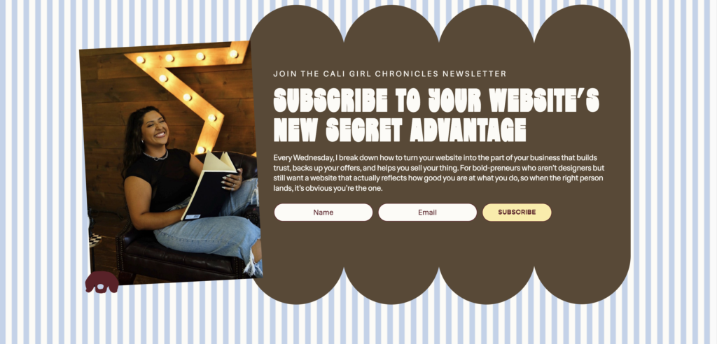
Joyce at Guapa Studios is a Showit website designer for service providers who writes the Cali Girl Chronicles newsletter. She builds websites that stand OUT in the crowded online space, and her own is no exception – her entire site and branding, including her Subscribe page, are stunning.
WHY IT WORKS:
- The opt-in copy at the top of the page HITS – it’s super actionable and tells you exactly what you’ll get in an engaging way.
- She includes great social proof in a super cute interactive section.
- Her mini bio gives people a peek of her personality and gives a quick rundown of what she does for people new to her world.
You can view the Cali Girl Chronicles landing page and subscribe here.
Studio Nadaske
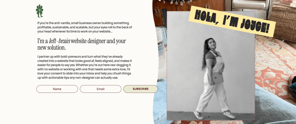
Elle at Studio Nadaske is a website copywriter for girls’ girls, and her newsletter, Doppio Over Ice, is one of the hottest in the online space right now. If I didn’t already know Elle was lovely and smart, her Subscribe page would instantly convince me.
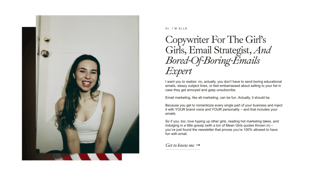
WHY IT WORKS:
- The headline – I mean, hello. Why the heck wouldn’t you wanna subscribe!?
- She includes a strategic nod to her email marketing audit service – this is honestly just super smart and likely relevant to anyone who reads that far down the page.
- Her mini bio builds trust by breaking the fourth wall a bit, and every line hits.
You can view the Doppio Over Ice landing page and subscribe here.
Maria John
Maria John is a website and sales page copywriter who writes a weekly newsletter called Conversion Ovation. The newsletter is mainly about copy and conversion-related topics, but her brand itself is movie-themed, and there are so many fun, strategic elements integrated throughout her Subscribe page in a way that just makes it feel like her.
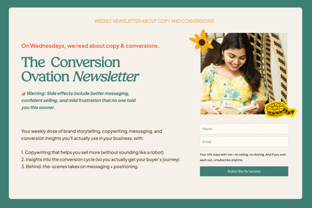
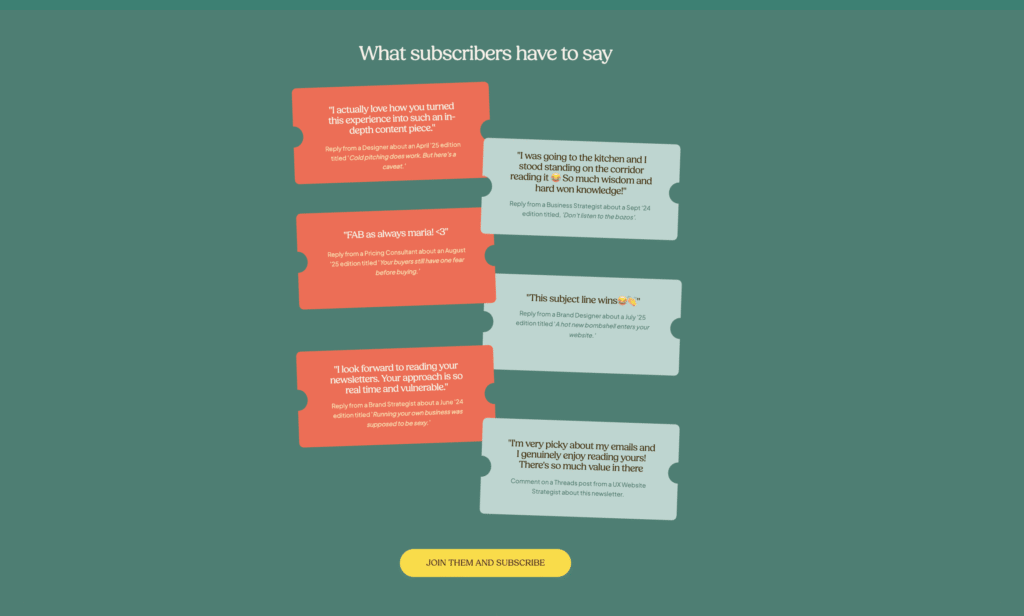
WHY IT WORKS:
- The “🍿Warning:” description instantly captures attention and integrates her theming, so her newsletter feels like a thought-out, connected piece of her brand.
- She provides lots of social proof in a fun, creative way.
- She links to some of her blog posts towards the end of the page – great for keeping people engaged and on her site longer.
You can view the Conversion Ovation landing page and subscribe here.
Sunny Send Up
Obviously, I’m gonna feature yours truly in this roundup – because as far as I’m concerned, that’s just good marketing. BUT my newsletter *is* one of my favorite ways to show up online, I’ve been told it’s valuable, and I happen to be pretty proud of my Subscribe page.
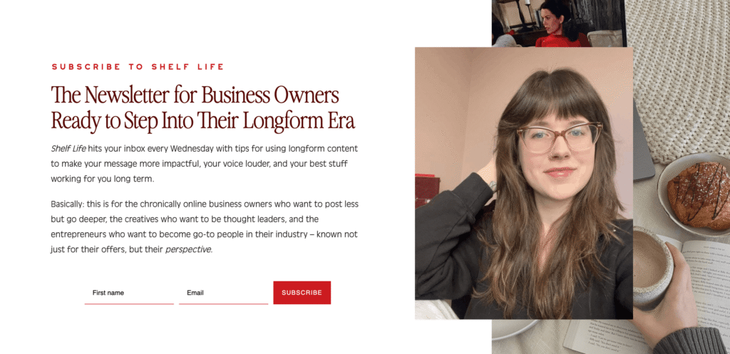
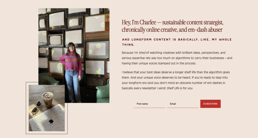
WHY IT WORKS:
- The description makes it clear exactly who it’s for.
- I included a link to my full newsletter archive and three editions that performed well.
- In my mini bio at the bottom of the page, I explained why Shelf Life exists, hinted at my unique perspective (aka my differentiator), and included a final call to subscribe.
You can view the Shelf Life landing page and subscribe here.
Recap: What Makes a Good Subscribe Page
Notice how these examples don’t follow the exact same formula? That’s because there’s no one “right” way to create a Subscribe page.
But the newsletter landing pages that convert usually have these things in common:
→ They aren’t boring. Trying to convince someone to subscribe for wEeKlY uPdAtEs just straight up isn’t going to work. It’s boring. The best Subscribe pages should grab you either with a hooky headline or a compelling description that engages right away.
→ They make it clear who the newsletter is for and what you’ll get. Vague promises of “tips and tricks” aren’t going to make someone subscribe if their inboxes are already overflowing with 48327 other newsletters. Your Subscribe page should make it clear that your newsletter is for *them* and exactly what it’ll give them.
→ They feel like the person behind the newsletter. Good Subscribe pages aren’t stiff or overly formal. They should sound like you, the actual human that’s going to be showing up in someone’s inbox if they subscribe.
Where Else To Put Newsletter Opt-In Forms
While I believe everyone with an email newsletter should have a Subscribe page on their website, it also shouldn’t be the ONLY place you have an opt-in form.
The more well-placed, on-brand opt-in forms you have throughout your website, the more chances to convert your website visitors into email subscribers.
For more tips on website opt-in placement and how to leverage forms to grow your email list, check out this blog post here.
You May Also Like